Sand Is Not Beige: A Desert Colour Palette for Interiors
The desert is rose at dawn, ochre at noon and violet by evening. A room that borrows those hours honestly will never read as beige.
, Dubai
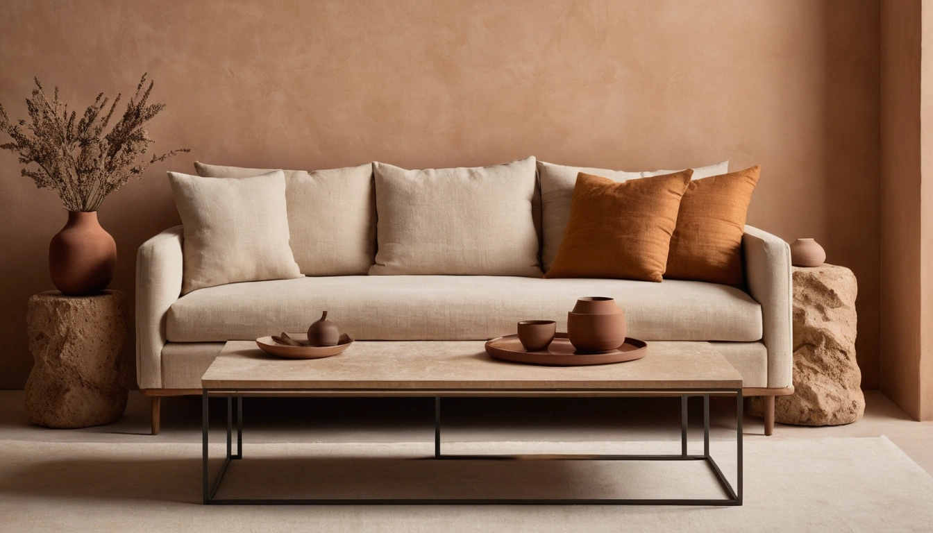
Drive out towards Al Qudra before sunrise and look at the sand. It is not beige. It is rose with grey at its edges, and the shadows between the dunes lean violet. By ten the same ground has hardened into ochre and bone; by six in the evening it has gone amber, and for twenty minutes after that it is the colour of a fading bruise. A desert colour palette for interiors begins with this observation rather than with a paint chart, because the desert is not one colour. It is one material under a changing light, and the rooms that borrow from it convincingly are the ones built on that difference.
The failed version is easy to picture because most of us have stood in it. Walls in a cautious greige, a sofa in a marginally warmer greige, a rug splitting the difference, warm-white downlights over the lot. Every surface sits in the same narrow band of mid-tone; nothing is allowed to go properly dark or properly pale. Designers have a private name for the result, grey-beige soup, and the notable thing about the soup is that it is not even restful. The eye keeps looking for somewhere to land and finds nothing.
The Desert Keeps Different Hours
A palette with depth borrows the desert’s whole day and gives each hour a job. The noon range, ochre through bone through pale sand, takes the large surfaces: walls, floors, the biggest pieces of upholstery. These are the tones that make a room feel warm without ever announcing themselves, and they should do most of the square metres.
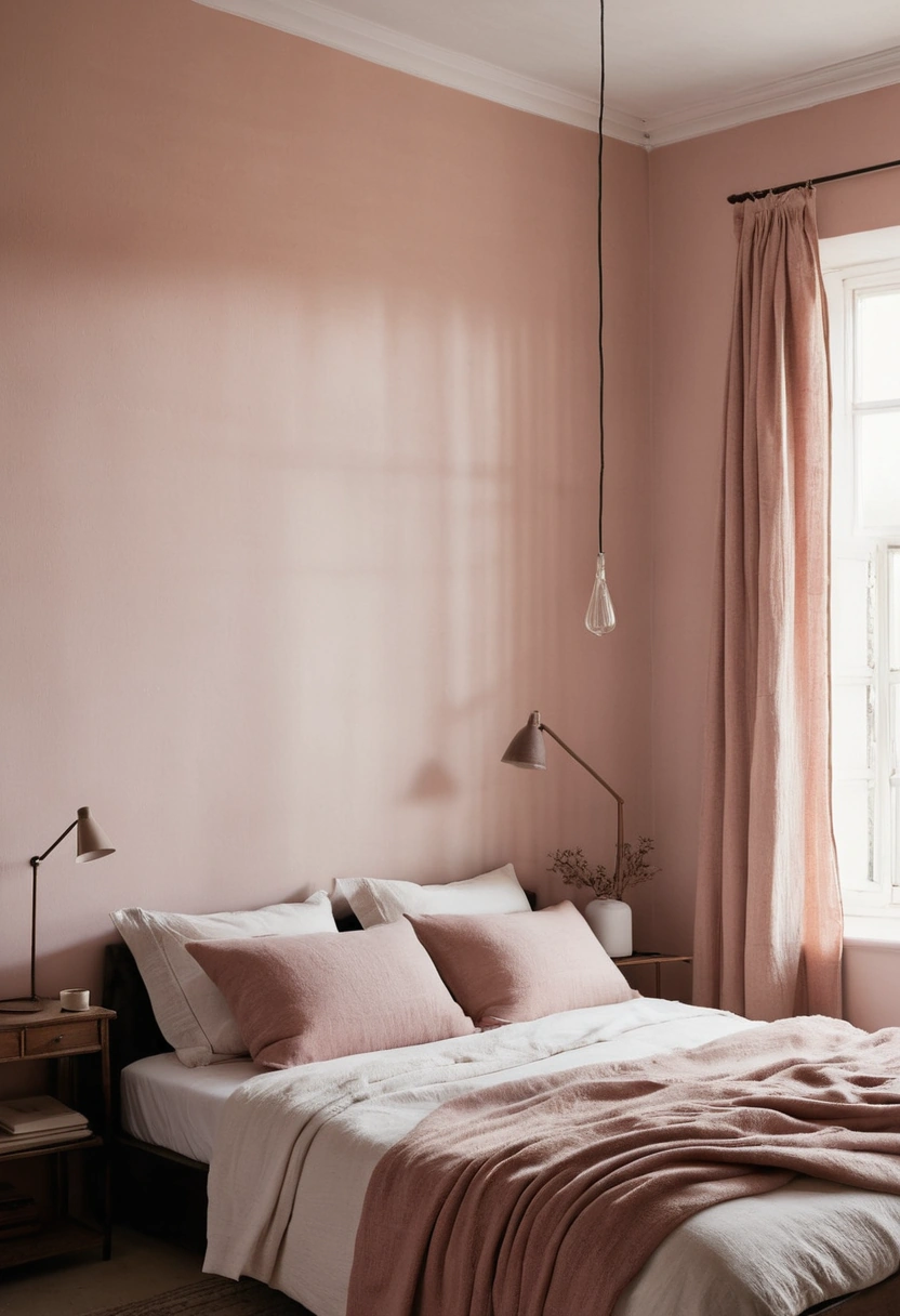
Dawn supplies the middle distance. The pink-greys and muted roses that last half an hour over the dunes translate into linen curtains, a limewashed bedroom wall, a heavy cotton bedcover. They are the hardest tones to buy well, because on a paint card they look like nothing at all, and on a wall at full scale they quietly change the temperature of the entire room.
Dusk supplies the darks, and the darks are not optional. The violet-brown of a dune shadow becomes a chocolate leather chair, a smoked-oak shelf, a doorway painted several steps deeper than the wall around it. A landscape without shadow is a car park; a room without darkness is a showroom. One properly dark element per room is a sensible minimum, and two rarely hurt.
Undertones Are the Whole Game
Warm neutrals split into families: pink-based, yellow-based, and the green-greys that pass for warm in northern light and die here. Undertone discipline means choosing one family for the big surfaces and staying inside it, then crossing families only once, deliberately, with the accent. Mixing them by accident is precisely how the soup gets made, because clashing undertones read as murk rather than contrast, and no amount of styling rescues murk.
Test everything at home, at scale, at three times of day. Light arrives here through glass that is usually tinted, often screened, and softened again by how you treat your windows; a swatch that behaved itself in the shop will behave quite differently behind a sheer at four in the afternoon. A metre-square painted board moved around the flat for a week costs a few dirhams and prevents most of the expensive mistakes.
Let the Materials Carry the Colour
The strongest desert palettes barely use paint at all. Travertine has ochre, bone and shadow running through every tile; clay plaster shifts across a wall as the sun moves; unlacquered brass supplies amber now and a bruised brown patina later; terracotta, linen and wool each hold three or four tones inside what a flat painted surface would render as one. When you are weighing marble against porcelain for the floor, this is the honest argument for stone with visible movement: the floor becomes the palette’s foundation rather than a mute plane underneath it.
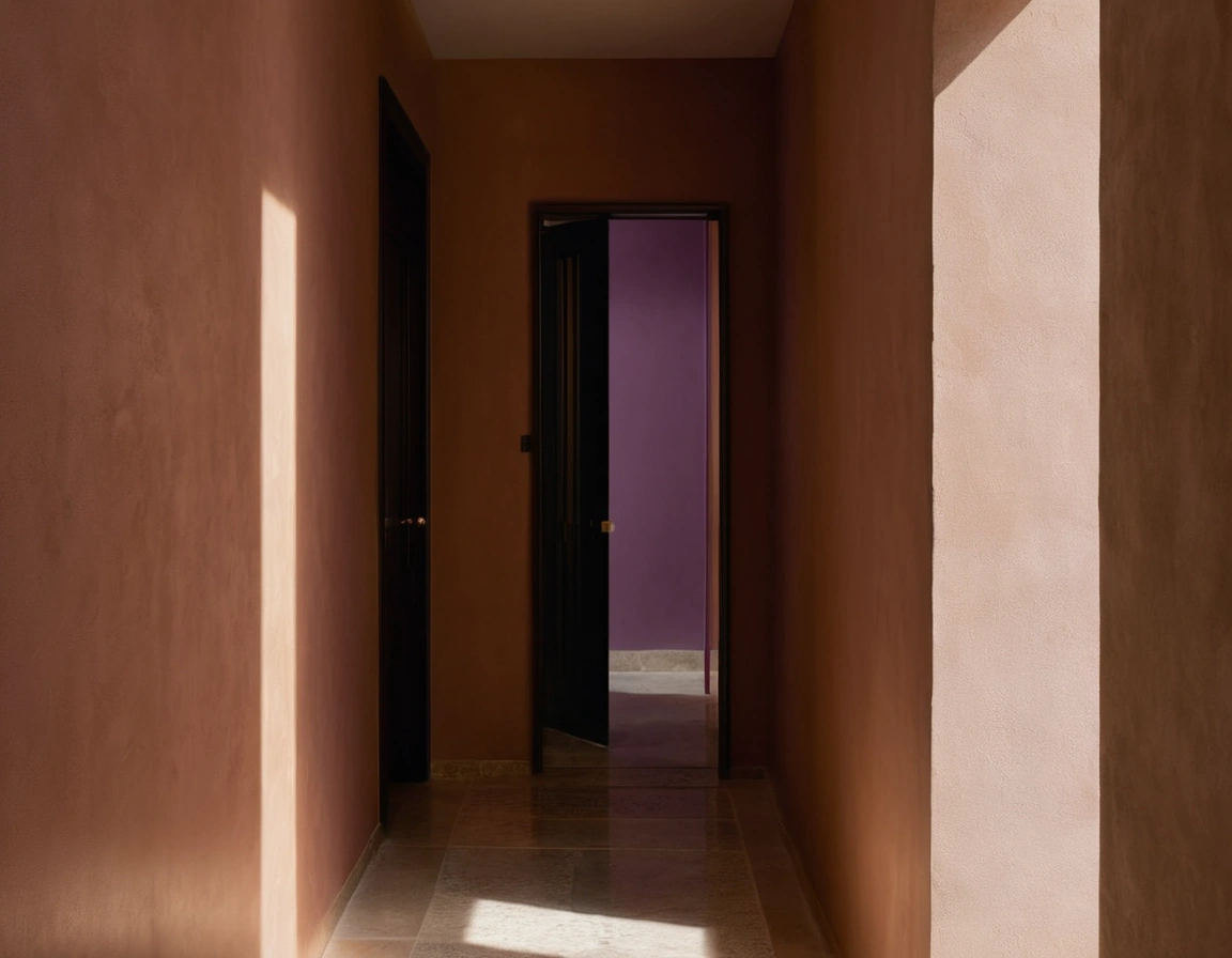
Material colour also solves the flatness problem on its own. Two clay-plastered walls in the same nominal shade will never quite match across a day, and that slight disagreement is the depth. A room finished this way can run three closely related tones and still feel layered, where the same three tones in vinyl emulsion would collapse back into soup.
One Mineral, Not a Rainbow
Every palette this quiet needs one deliberate interruption, and the desert suggests where to find it: in minerals. Iron oxide gives rust and oxblood; copper weathers to a deep blue-green; both belong to the landscape’s own chemistry, which is why they never look imported. Choose one, then repeat it exactly twice more across the room, a cushion, a glazed bowl, the painted inside of a bookcase. Scattered accents read as indecision; a repeated accent reads as intent.
Green deserves its own note, because the temptation is to paint it on. Better to let it be alive: plants that survive the air-conditioning bring in a green that moves, varies and occasionally sulks, which is the only green a desert palette really wants. A painted sage wall is a decision; a dracaena is a companion.
Where Good Palettes Go to Die
The quickest death is lighting. An all-cream scheme under warm LEDs curdles into margarine by nine in the evening; the fix is not cooler bulbs everywhere but a layered lighting scheme that pools warm light down low, where amber flatters wood and brass, and lights the walls more honestly. The second death is the all-cream room itself, the soup’s polite cousin: no darks, no accent, no undertone risk, and consequently no room, just an expensive absence with a sofa in it.
Sand, in other words, was never the problem. Beige is a failure of attention, and attention costs nothing. Watch the desert through one full day, even from the E611 at speed, and you come home with a palette no fan deck will ever hand you: rose over grey, ochre over bone, and a violet shadow holding the whole thing down.