Mashrabiya Without Kitsch: Arabic Pattern in Modern Homes
Geometry that once managed light, air and privacy has been flattened into a lobby cliché. Used at the right scale, in the right material, it still does what it always did: turn sun into shadow.
, Dubai
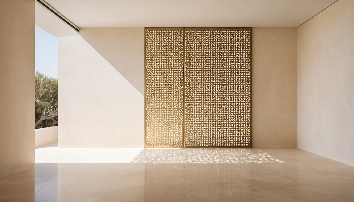
The mashrabiya was never decoration. Its lattice did three jobs at once: it cut the glare while letting air through, it let the person inside watch the street without being watched, and it broke direct sun into a moving field of shadow. Every one of those jobs concerned light and air; none of them concerned style. Which is why Arabic pattern in modern homes goes wrong at exactly the moment it is treated as a surface finish, something applied to a wall the way a logo is applied to a carrier bag, instead of as a working element that does something to the light passing through it.
Hotels made the mistake profitable. Somewhere between the lobby water feature and the eighth laser-cut partition, the eight-fold star stopped being geometry and became branding, and homeowners understandably concluded that the whole tradition was a theme to be either embraced wholesale or avoided entirely. It is neither. It is an instrument, and instruments reward restraint.
An Instrument, Not a Motif
A screen earns its place by what it does, and what it does depends on where it stands. Set a hand’s width in front of a west-facing window, a pierced panel turns the worst two hours of sun into a slow shadow-play across the floor; the same panel glued flat to a corridor wall does nothing except collect dust in eighty small openings. The reasoning is the same one that shaped old Gulf houses from the roof down; what the barjeel once did with moving air, the mashrabiya did with moving light, and both worked because they sat between the climate and the room rather than on the room’s surface.
Depth matters more than the pattern itself. A lattice with real thickness throws shadows that stretch, sharpen and soften through the day, so the wall behind it is never the same twice. That performance depends partly on how the window is dressed, since a blackout blind dropped behind a screen simply switches the instrument off; sheers and screens cooperate, heavy curtains and screens compete.
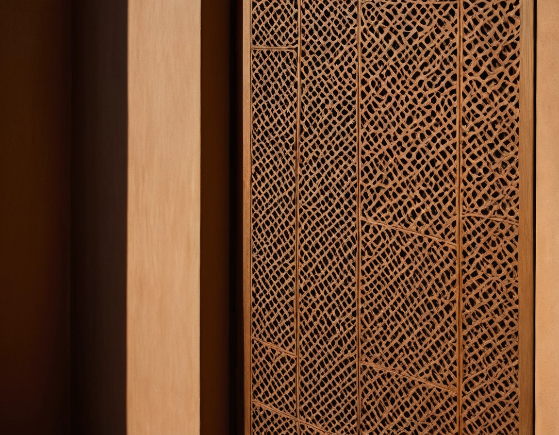
One Pattern, and Make It Large
The discipline separating a considered room from a themed one fits in a sentence: one geometry per room, at generous scale, and everything else plain. Two patterns compete for attention; three become a film set. A single motif repeated across one screen, surrounded by plain plaster, a plain floor and plain upholstery, reads as architecture. The identical motif echoed on cushions, a rug and a pendant shade reads as merchandising, and no individual piece is to blame.
Scale does the remaining work. Openings around the size of your palm read calm and structural; openings the size of a thumbnail read busy, closer to gift-wrap than to geometry, and busier still once their shadows double them. Enlarging a motif until it feels slightly too big is the reliable correction, because a pattern that can be read from across the room slows down, while one that dissolves into texture speeds up. If a screen already carries the geometry, the soft furnishings should decline to answer it.
Where the pattern lives matters nearly as much as how big it is. Good candidates are the places that already sit between zones: a screen dividing entry from living room, a panel that lets a studio pretend to have a bedroom, a pierced balustrade on a stair. Poor candidates are surfaces with jobs of their own; a patterned splashback fights the kitchen, and a patterned ceiling fights everyone underneath it. Old Gulf houses put their geometry at thresholds and openings, which is worth copying for a practical reason as well as a respectful one: thresholds are where the light changes, and this is ornament that feeds on changing light.
Metal, Wood and the Weight of Shadow
Laser-cut metal is the contemporary default for good reasons. Sheet aluminium or steel cuts to a crisp line, stays flat across a double-height stairwell, shrugs off humidity and powder-coats to any colour a wall can take; its shadows are thin and precise, closer to drawing than to carving. The price is warmth. At close range, beside a bed or across a majlis opening, a metal screen can feel like office joinery, and the thinness that makes the shadows sharp makes the object itself slightly weightless.
Timber answers that, at a cost. Wood brings depth of section, so shadows blur and soften at their edges, and the panel reads as furniture rather than fret-cut sheet. It also brings joinery lead times and quotes that vary widely between workshops; expect several weeks and a proper conversation about section sizes before anything is cut. A commission of this kind sits naturally in the lineage of sadu, khoos and carved gypsum, and a maker fluent in that tradition will land on proportions no downloaded cutting file quite reproduces.
The Hotel Lobby Problem
Maximalism fails at home for reasons that have little to do with taste. A lobby has ten-metre ceilings, a lighting budget and a viewer who passes through in ninety seconds; pattern on every surface works there the way a stage set works, at a distance and briefly. A flat has a tenth of the volume and a viewer who stays for years. Scaled into a living room, the same density stops being generous and becomes upholstered wallpaper, and within a month the occupant stops seeing it at all.
Home asks for the opposite ratio: one working screen, one field of shadow, and around them the quiet company of plain surfaces and a shelf of honest souk finds, objects rather than motifs. Restraint here is not timidity; it is what lets the geometry keep its old authority instead of shrinking into theme.
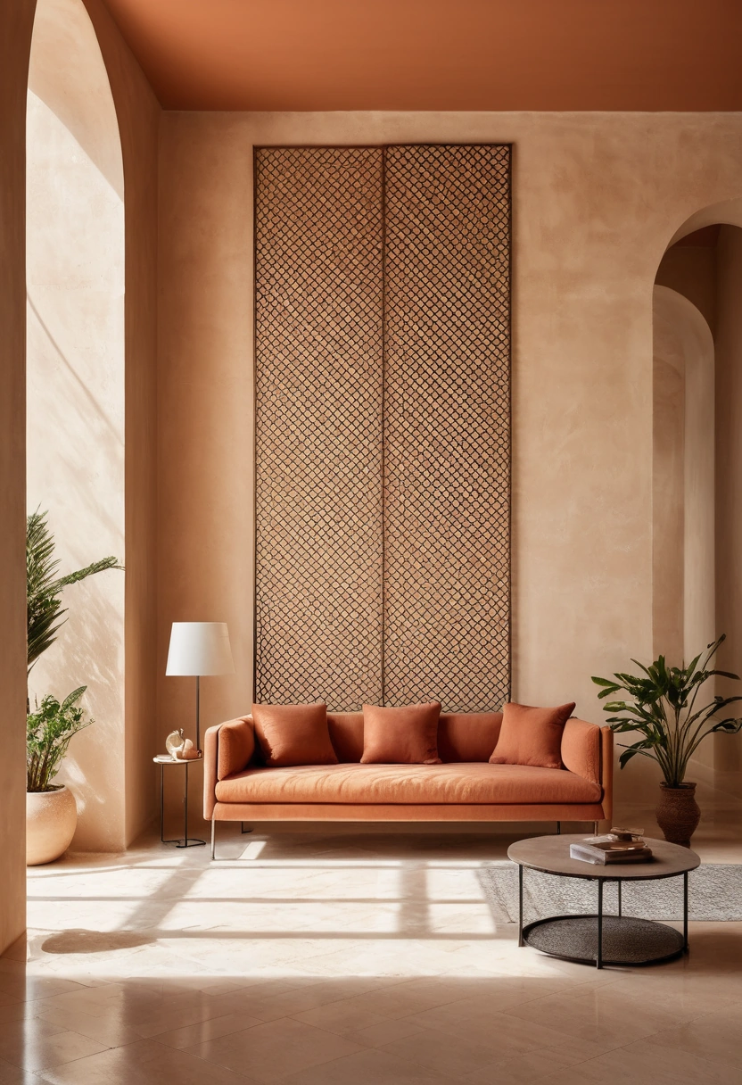
The pattern then does what it has always done in this part of the world. It manages the sun, it guards the interior, and twice a day, when the light comes through at a low angle, it reminds you why anyone bothered to cut eighty small openings in a perfectly good panel.